
TATA.ev brand identity encapsulates Tata Motors’ unwavering commitment to sustainability, innovation, and community development, in line with the overarching goals of the Tata Group
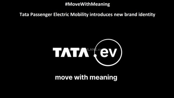
Embodying the core philosophies of ‘Move With Meaning’, Tata Passenger Electric Mobility launched its new brand identity. Called Tata.ev, this is the EV-specific business of Tata Motors. Community development is one of the primary goals for Tata behind this step. Tata.ev is the brainchild of the consumer-facing brand identity approach for the future of mobility.
Tata.ev – Say Hello to Tata’s new EV-specific brand
The company has ‘Move with Meaning’ at the core of this new shift in product positioning. Word ‘move’ signifies collective human movement towards a greener, safer and smarter future. While the word ‘meaning’ represents Tata’s commitment to future readiness.
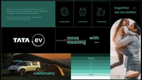
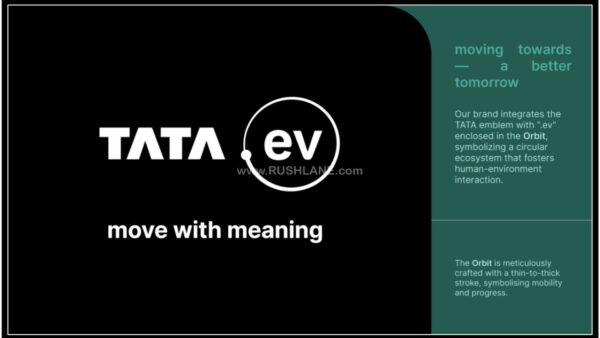
New logo has ‘ev’ written in the middle, enclosed within an orbit. There is a dot in this logo as well and it orbits around ‘ev’ word. This orbit is not uniform, as seen in the images. This orbit emerges and re-merges into this dot and could mean a circular ecosystem where humans and environment co-interact, progressing towards a brighter future. The brand has a colour identity, Evo Teal. Tata.ev has a distinct sound for the brand as well. This sound consists of electronic circuits and powerful ripple sounds.
What does this mean?
Tata.ev reflects the company’s commitment to environment-friendly advancements in future products. Some of these are to reduce ink usage in print material, reduce battery consumption and energy usage, optimised performance, and to cut down on file sizes for quicker loading times.
To address evolving needs of EV buyers, Tata.ev will incorporate a 3-phase EV strategy. This way, Tata.ev will capitalise the Indian market with different body style EVs at different price points. Tata.ev branding will remain PV exclusive for now.
Building Blocks of TATA.ev’s Identity
The Orbit: The “.ev” in the logo mark is encapsulated within an orbit, demonstrating how TATA.ev fosters a circular ecosystem of human and environmental interaction, all progressing toward a brighter future.
Brand Colour: The distinctive Evo Teal color represents the fusion of technology and sustainability, underscoring TATA.ev’s innovation and commitment to a sustainable future.
Inter Typeface: The use of the open-source Inter typeface reflects modernity and accessibility, aligning with the brand’s sustainability-first approach.
Sound of TATA.ev: The motion and sonic logo combine tradition and innovation, creating a sense of progress by blending electronic circuits with a powerful ripple sound, inspired by the intersection of nature and technology.
The Character: The introduction of the ‘bridge’ element in typography infuses communication with a sense of motion and dynamism.
Manufacturer’s words
Commenting on the new brand identity, Mr. Vivek Srivatsa, Head, Marketing, Sales and Service Strategy, Tata Passenger Electric Mobility Ltd. said, “We are entering a new era with TATA.ev. Our new brand identity for electric vehicles underlines our commitment to accelerate the adoption of clean energy mobility solutions.
We intend to drive positive change in the automotive industry with the focus on sustainability, community, and technology. Both the products and services are intended to create highly differentiated and meaningful consumer experiences. The brand personality is humane, honest, invigorating, and conversational – a rallying point for those curious about having a better impact on the world.”